Soul Noodle
Soul Noodle
Soul Noodle
Redesigned a mobile order website for a restaurant to realise a first-time-friendly browsing, order, and checkout process.
Brand and item names and images are replaced by loyalty-free images for copyright reasons.
Redesigned a mobile order website for a restaurant to realise a first-time-friendly browsing, order, and checkout process.
Brand and item names and images are replaced by loyalty-free images for copyright reasons.
Redesigned a mobile order website for a restaurant to realise a first-time-friendly browsing, order, and checkout process.
Brand and item names and images are replaced by loyalty-free images for copyright reasons.
Duration
Duration
Duration
Dec - Jan 2024
Dec - Jan 2024
Dec - Jan 2024
Type of Project
Type of Project
Type of Project
Personal Passion Project
Personal Passion Project
Personal Passion Project
Redesign
Redesign
Redesign
Tools
Tools
Tools
Figma
Figma
Figma
Problem
Problem
Problem
Working at a restaurant, I noticed that there are some usability issues with our mobile order website:
Unclear instruction and multiple checkout screens confuse users whether or not they have placed orders
Many customers leave without paying due to confusing order process and word choices (i.e. using "checkout" and "order" interchangeably)
Lack of instructions in some areas hindering successful order completion
Goal
Goal
Goal
Improve the ordering experience with straightforward instructions, conventional interface, and intuitive browsing and order processes, while adhering to the brand identity.
Improve the ordering experience with straightforward instructions, conventional interface, and intuitive browsing and order processes, while adhering to the brand identity.
Improve the ordering experience with straightforward instructions, conventional interface, and intuitive browsing and order processes, while adhering to the brand identity.
Ideation
Ideation
Ideation
Customer's Needs
Customer's Needs
Customer's Needs
Clear instructions on payment or online payment options
Straightforward ordering process
Easy access to log-in and sign-up pages and vouchers
Easy access to order receipts (e.g. for split payment)
Clear instructions on payment or online payment options
Straightforward ordering process
Easy access to log-in and sign-up pages and vouchers
Easy access to order receipts (e.g. for split payment)
Clear instructions on payment or online payment options
Straightforward ordering process
Easy access to log-in and sign-up pages and vouchers
Easy access to order receipts (e.g. for split payment)
Company's Needs
Company's Needs
Company's Needs
Retain pay-at-till to keep the customer-staff interactions
Clear instructions on payment to avoid customers' confusion
Straightforward ordering pages and instructions to improve customer experience
Easy access to log-in and sign-up pages to offer personalised promotions
Retain pay-at-till to keep the customer-staff interactions
Clear instructions on payment to avoid customers' confusion
Straightforward ordering pages and instructions to improve customer experience
Easy access to log-in and sign-up pages to offer personalised promotions
Retain pay-at-till to keep the customer-staff interactions
Clear instructions on payment to avoid customers' confusion
Straightforward ordering pages and instructions to improve customer experience
Easy access to log-in and sign-up pages to offer personalised promotions
User Flow Chart
User Flow Chart
User Flow Chart
User flow chart clarified
a rough estimate of the number of pages
how pages interact
actionable buttons needed
contents/topics displayed on each page
User flow chart clarified
a rough estimate of the number of pages
how pages interact
actionable buttons needed
contents/topics displayed on each page
User flow chart clarified
a rough estimate of the number of pages
how pages interact
actionable buttons needed
contents/topics displayed on each page

Design
Design
Design
Analysing Original Website
Analysing Original Website
Analysing Original Website
I analysed the original website to identify brand identity, website features, layout inspirations, and specific usability issues.
I analysed the original website to identify brand identity, website features, layout inspirations, and specific usability issues.
I analysed the original website to identify brand identity, website features, layout inspirations, and specific usability issues.

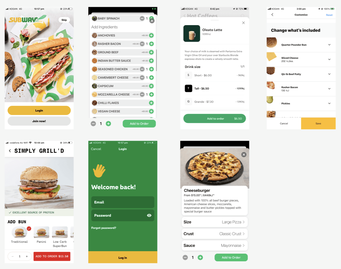
Comparing Restaurant Apps
Comparing Restaurant Apps
Comparing Restaurant Apps
I examined and compared the UI designs of several mobile order apps from famous brands: Starbucks, McDonalds, Subway, Nandos, and Grill'd. It helped me identify conventional order process and designs to adopt to my redesign.
I examined and compared the UI designs of several mobile order apps from famous brands: Starbucks, McDonalds, Subway, Nandos, and Grill'd. It helped me identify conventional order process and designs to adopt to my redesign.
I examined and compared the UI designs of several mobile order apps from famous brands: Starbucks, McDonalds, Subway, Nandos, and Grill'd. It helped me identify conventional order process and designs to adopt to my redesign.
Creating Components
Creating Components
Creating Components
In this project, I learned how to make components: adding and subtracting items, switching selections, and viewing and hiding passwords.
In this project, I learned how to make components: adding and subtracting items, switching selections, and viewing and hiding passwords.
In this project, I learned how to make components: adding and subtracting items, switching selections, and viewing and hiding passwords.

Prototype
Prototype
Prototype

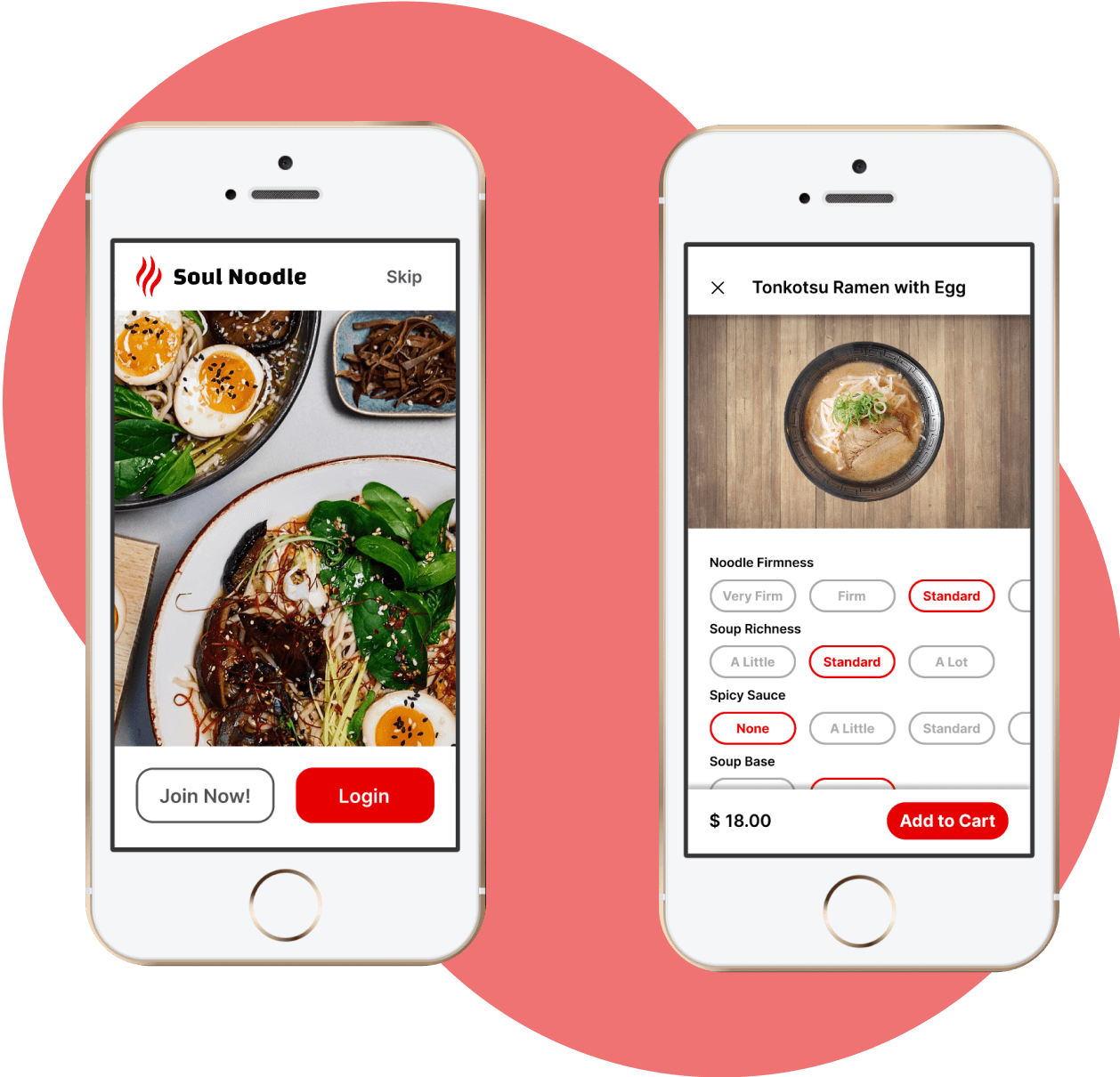
Landing Page
Landing Page
Landing Page
Communicates brand and links to sign up and log in
Communicates brand and links to sign up and log in
Communicates brand and links to sign up and log in


Menu
Menu
Menu
Search bar for easy search and menu tabs for item categories
Search bar for easy search and menu tabs for item categories
Search bar for easy search and menu tabs for item categories


Customise Order
Customise Order
Customise Order
Easily switch between options, and add and subtract toppings
Easily switch between options, and add and subtract toppings
Easily switch between options, and add and subtract toppings
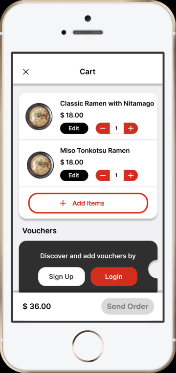
Place Order
Place Order
Place Order
A single order page to make ordering process simple, with quick access to member login page
A single order page to make ordering process simple, with quick access to member login page
A single order page to make ordering process simple, with quick access to member login page
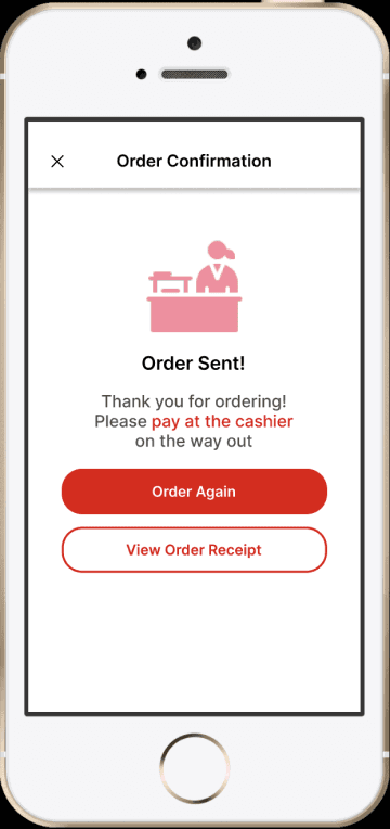
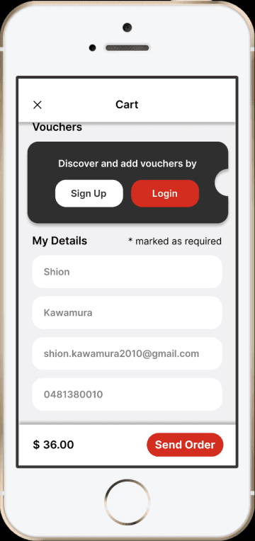
Payment Guidance
Payment Guidance
Payment Guidance
Customers are instructed to pay at the cashier and can access receipt for split bills
Customers are instructed to pay at the cashier and can access receipt for split bills
Customers are instructed to pay at the cashier and can access receipt for split bills
