Redesigning Ramen Order
Redesigned a mobile ordering website for a restaurant, for a more intuitive interface and a more seamless ordering experience.


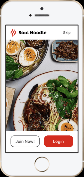
Practical sign up interface that expresses any branding
Login/sign up and profile pages are great places to express branding, with colour scheme, logos, and images. Simultaneously, their design should be straightforward and somewhat generic, for a friction-free sign up process.
Finding and customising ramen made easier than ever
Most of our customers visit our stores, craving for a particular type of ramen, or flavour. The menu items are now categorised based on flavours and common dietary preferences. The ramen customisations are now pre-selected for quick order and slurp, but still allows easy customisation for the ramen-lovers.


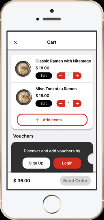
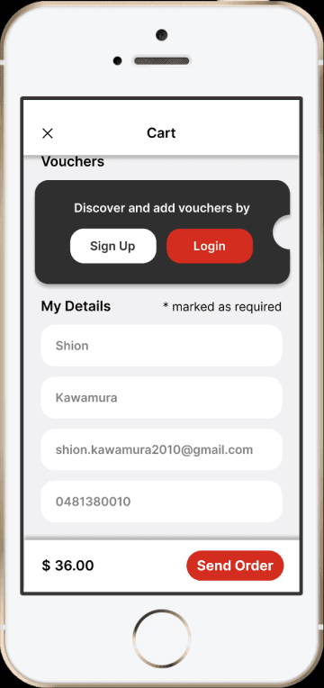
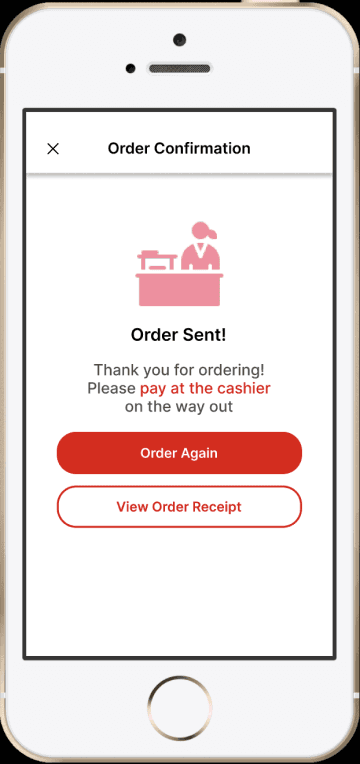
Ordering to checkout flow specifically designed for first-time customers
Many first-time customers struggled to complete the order, due to confusing wording and unconventional order screen designs. Inspired by many restaurant apps, the website now has a single order page and clear flow and instructions applied throughout the order process.
Redesigning Ramen Order
Redesigned a mobile ordering website for a restaurant, for a more intuitive interface and a more seamless ordering experience.
See in Figma
Practical sign up interface that expresses any branding
Login/sign up and profile pages are great places to express branding, with colour scheme, logos, and images. Simultaneously, their design should be straightforward and somewhat generic, for a friction-free sign up process.
Finding and customising ramen made easier than ever
Most of our customers visit our stores, craving for a particular type of ramen, or flavour. The menu items are now categorised based on flavours and common dietary preferences. The ramen customisations are now pre-selected for quick order and slurp, but still allows easy customisation for the ramen-lovers.
Ordering to checkout flow specifically designed for first-time customers
Many first-time customers struggled to complete the order, due to confusing wording and unconventional order screen designs. Inspired by many restaurant apps, the website now has a single order page and clear flow and instructions applied throughout the order process.
Redesigning Ramen Order
Redesigned a mobile ordering website for a restaurant, for a more intuitive interface and a more seamless ordering experience.
See in Figma
Practical sign up interface that expresses any branding
Login/sign up and profile pages are great places to express branding, with colour scheme, logos, and images. Simultaneously, their design should be straightforward and somewhat generic, for a friction-free sign up process.


Finding and customising ramen made easier than ever
Most of our customers visit our stores, craving for a particular type of ramen, or flavour. The menu items are now categorised based on flavours and common dietary preferences. The ramen customisations are now pre-selected for quick order and slurp, but still allows easy customisation for the ramen-lovers.


Ordering to checkout flow specifically designed for first-time customers
Many first-time customers struggled to complete the order, due to confusing wording and unconventional order screen designs. Inspired by many restaurant apps, the website now has a single order page and clear flow and instructions applied throughout the order process.
